library(tidyverse)
library(scales)
library(foreach)Algorithms for prediction
For two sessions, we will cover a few algorithms for prediction. We aim to
- draw connections between algorithms often viewed as classical statistics (e.g., multilevel models) and those often viewed as machine learning (e.g., penalized regression)
- by learning a few new methods, become comfortable with the skills to read about additional new methods on your own in the future
This page contains embedded R code. If you are a Stata user, you can download do files that illustrate Ordinary Least Squares, multilevel models, ridge regression, LASSO regression, and trees and forests.
A version of this page in slide format is available here:
Here is a PDF of this page for those taking notes by hand.
Data: Baseball salaries
We will explore algorithms for prediction through a simple example dataset. The data contain the salaries of all 944 Major League Baseball Players who were on active rosters, injured lists, and restricted lists on Opening Day 2023. These data were compiled by USA Today. After scraping the data and selecting a few variables, I appended each team’s win-loss record from 2022. The data are available in baseball_population.csv.
baseball_population <- read_csv("https://ilundberg.github.io/soc212b/data/baseball_population.csv")The first rows of the data are depicted below. Each row is a player. The player Madison Bumgarner had a salary of $21,882,892. His position was LHP for left-handed pitcher. His team was Arizona, and this team’s record in the previous season was 0.457, meaning that they won 45.7% of their games.
# A tibble: 944 × 6
  player               salary position team    team_past_record team_past_salary
  <chr>                 <dbl> <chr>    <chr>              <dbl>            <dbl>
1 Bumgarner, Madison 21882892 LHP      Arizona            0.457         2794887.
2 Marte, Ketel       11600000 2B       Arizona            0.457         2794887.
3 Ahmed, Nick        10375000 SS       Arizona            0.457         2794887.
# ℹ 941 more rows
We will summarize mean salaries. Some useful facts about mean salaries are that they vary substantially across positions and also across teams.
Code
baseball_population |>
  group_by(position) |>
  summarize(salary = mean(salary)) |>
  mutate(position = fct_reorder(position, -salary)) |>
  ggplot(aes(x = position, y = salary)) +
  geom_bar(stat = "identity") +
  geom_text(
    aes(
      label = label_currency(
        scale = 1e-6, accuracy = .1, suffix = " m"
      )(salary)
    ),
    y = 0, color = "white", size = 3, fontface = "bold",
    vjust = -1
  ) +
  scale_y_continuous(
    name = "Average Salary",
    labels = label_currency(scale = 1e-6, accuracy = 1, suffix = " million")
  ) +
  scale_x_discrete(
    name = "Position",
    labels = function(x) {
      case_when(
        x == "C" ~ "C\nCatcher",
        x == "RHP" ~ "RHP\nRight-\nHanded\nPitcher",
        x == "LHP" ~ "LHP\nLeft-\nHanded\nPitcher",
        x == "1B" ~ "1B\nFirst\nBase",
        x == "2B" ~ "2B\nSecond\nBase",
        x == "SS" ~ "SS\nShortstop",
        x == "3B" ~ "3B\nThird\nBase",
        x == "OF" ~ "OF\nOutfielder",
        x == "DH" ~ "DH\nDesignated\nHitter"
      )
    }
  ) +
  theme(axis.text.x = element_text(size = 7)) +
  ggtitle("Baseball salaries vary across positions")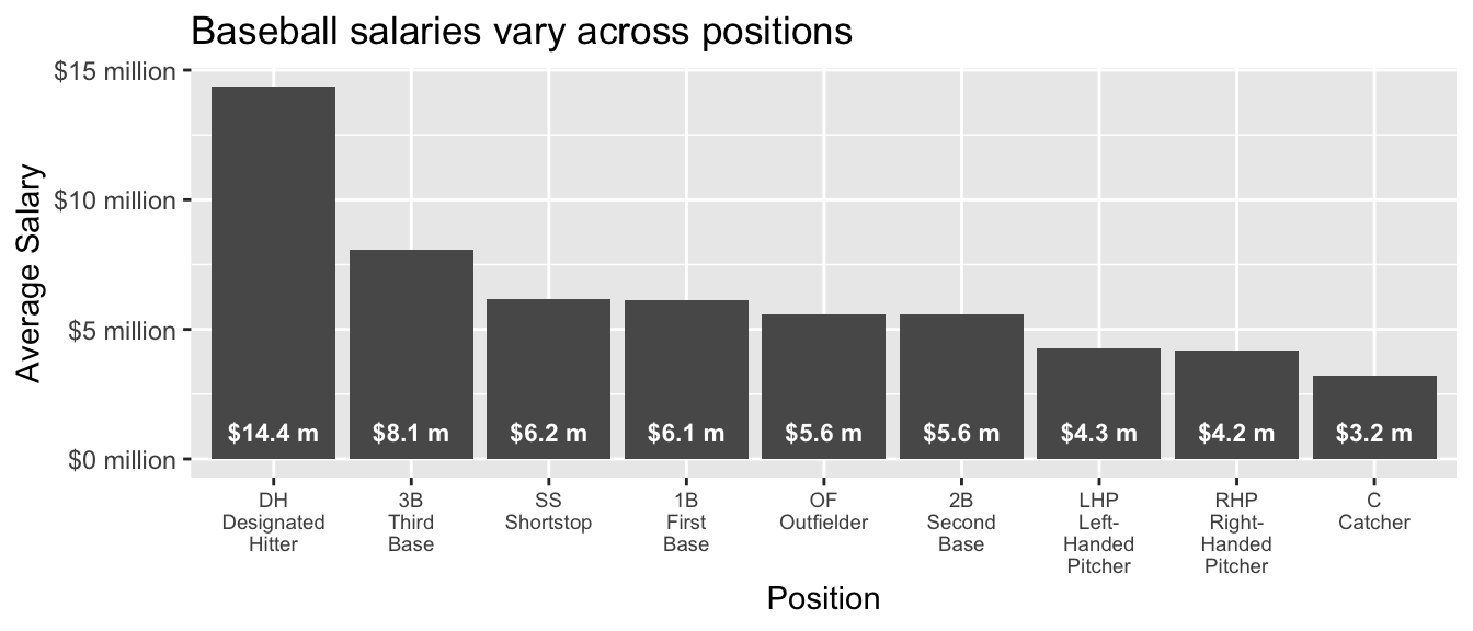
Code
baseball_population |>
  group_by(team) |>
  summarize(
    salary = mean(salary),
    team_past_record = unique(team_past_record)
  ) |>
  ggplot(aes(x = team_past_record, y = salary)) +
  geom_point() +
  ggrepel::geom_text_repel(
    aes(label = team),
    size = 2
  ) +
  scale_x_continuous(
    name = "Team Past Record: Proportion Wins in 2022"
  ) +
  scale_y_continuous(
    name = "Team Average Salary in 2023",
    labels = label_currency(
      scale = 1e-6,
      accuracy = 1,
      suffix = " million"
    )
  ) +
  ggtitle("Baseball salaries vary across teams")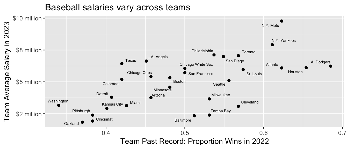
Task: Predict the Dodgers’ mean salary
As a task, we will often focus on estimating the mean salary of the L.A. Dodgers. Because we have the full population of data, we can calculate the answer directly:
true_dodger_mean <- baseball_population |>
  # Restrict to the Dodgers
  filter(team == "L.A. Dodgers") |>
  # Record the mean salary
  summarize(mean_salary = mean(salary)) |>
  # Pull that estimate out of the data frame to just be a number
  pull(mean_salary)
The true Dodger mean salary on Opening Day 2023 was $6,232,196. We will imagine that we don’t know this number. Instead of having the full population, we will imagine we have
- information on predictors for all players: position, team, team past record
- information on salary for a random sample of 5 players per team
baseball_sample <- baseball_population |>
  group_by(team) |>
  slice_sample(n = 5) |>
  ungroup()
In our sample, we observe the salaries of 5 players per team. Our 5 sampled Dodger players have an average salary of $7,936,238.
# A tibble: 5 × 6
  player           salary position team        team_past_record team_past_salary
  <chr>             <dbl> <chr>    <chr>                  <dbl>            <dbl>
1 Phillips, Evan  1300000 RHP      L.A. Dodge…            0.685         8388736.
2 Miller, Shelby  1500000 RHP      L.A. Dodge…            0.685         8388736.
3 Taylor, Chris  15000000 OF       L.A. Dodge…            0.685         8388736.
4 Betts, Mookie  21158692 OF       L.A. Dodge…            0.685         8388736.
5 Outman, James    722500 OF       L.A. Dodge…            0.685         8388736.
Our task is to predict the salary for all 35 Dodger players and average those predictions to yield a predicted vaue of the Dodgers’ mean salary on opening day 2023. The data we will use to predict include all variables except the outcome for the Dodger players.
dodgers_to_predict <- baseball_population |>
  filter(team == "L.A. Dodgers") |>
  select(-salary)
Ordinary Least Squares
To walk through the steps of our prediction task, we first consider Ordinary Least Squares. After walking through these steps, we will consider a series of more advanced algorithms for prediction that involve similar steps.
For OLS, we might model salary as a function of team_past_record. The code below learns this model in our sample.
ols <- lm(
  salary ~ team_past_record,
  data = baseball_sample
)
We can then make a prediction for every player on the Dodgers. Because our only predictor is a team-level predictor (team_past_record), the prediction will be the same for every player. But this may not always be the case, as further down the page when we consider position as an additional predictor.
ols_predicted <- dodgers_to_predict |>
  mutate(predicted_salary = predict(ols, newdata = dodgers_to_predict)) |>
  print(n = 3)
# A tibble: 35 × 6
player position team team_past_record team_past_salary predicted_salary
<chr> <chr> <chr> <dbl> <dbl> <dbl>
1 Freeman, Fr… 1B L.A.… 0.685 8388736. 5552999.
2 Heyward, Ja… OF L.A.… 0.685 8388736. 5552999.
3 Betts, Mook… OF L.A.… 0.685 8388736. 5552999.
# ℹ 32 more rowsFinally, we can average over these predictions to estimate the mean salary on the Dodgers.
ols_estimate <- ols_predicted |>
  summarize(ols_estimate = mean(predicted_salary))
By OLS prediction, we estimate that the mean Dodger salary was $5.6 million. Because we estimated in a sample and under some modeling assumptions, this is a bit lower than the true population mean of $6.2 million.
Performance over repeated samples
Because this is a hypothetical setting, we can consider the performance of our estimator across repeated samples. The chunk below pulls our code into a single function that we call estimator(). The estimator takes a sample and returns an estimate.
ols_estimator <- function(
    sample = baseball_sample,
    to_predict = dodgers_to_predict
) {
  # Learn a model in the sample
  ols <- lm(
    salary ~ team_past_record,
    data = sample
  )
  # Predict for our target population
  ols_predicted <- to_predict |>
    mutate(predicted_salary = predict(ols, newdata = to_predict))
  # Average over the target population
  ols_estimate_star <- ols_predicted |>
    summarize(ols_estimate = mean(predicted_salary)) |>
    pull(ols_estimate)
  # Return the estimate
  return(ols_estimate_star)
}
We can run the estimator repeatedly, getting one estimate for each repeated sample from the population. This exercise is possible because in this simplified setting we have data on the full population.
many_sample_estimates <- foreach(
  repetition = 1:100, .combine = "c"
) %do% {
  # Draw a sample from the population
  baseball_sample <- baseball_population |>
    group_by(team) |>
    slice_sample(n = 5) |>
    ungroup()
  # Apply the estimator to the sample
  estimate <- ols_estimator(baseball_sample)
  return(estimate)
}
Then we can visualize the performance across repeated samples.
Code
tibble(y = many_sample_estimates) |>
  # Random jitter for x
  mutate(x = runif(n(), -.1, .1)) |>
  ggplot(aes(x = x, y = many_sample_estimates)) +
  geom_point() +
  scale_y_continuous(
    name = "Dodger Mean Salary",
    labels = label_millions
  ) +
  theme_minimal() +
  scale_x_continuous(
    breaks = NULL, limits = c(-.5,.5),
    name = "Each dot is an OLS estimate\nin one sample from the population"
  ) +
  geom_hline(yintercept = true_dodger_mean, linetype = "dashed") +
  annotate(geom = "text", x = -.5, y = true_dodger_mean, hjust = 0, vjust = -.5, label = "True mean in\nDodger subpopulation", size = 3)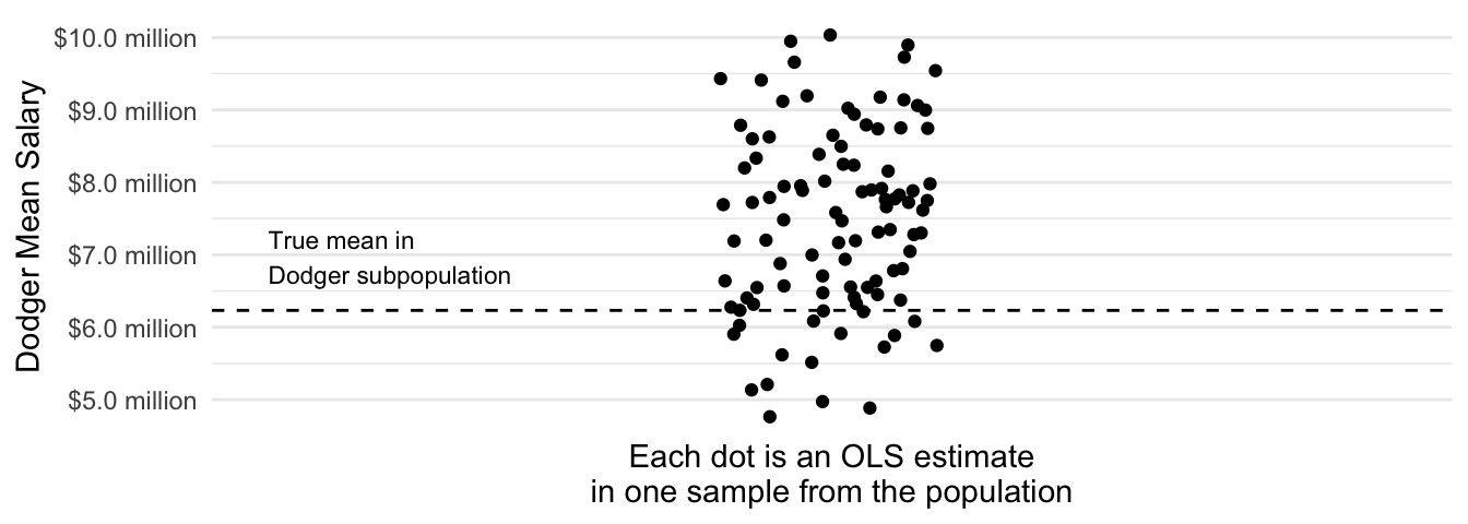
Across repeated samples, the estimates have a standard deviation of $1.3 million and are on average $1.2 million too high.
Model approximation error
An OLS model for salary that is linear in the team past record clearly suffers from model approximation error. If you fit a regression line to the entire population of baseball players you would see that th Dodger’s mean salary is below this line.
Code
population_ols <- lm(salary ~ team_past_record, data = baseball_population)
forplot <- baseball_population |>
  mutate(fitted = predict(population_ols)) |>
  group_by(team) |>
  summarize(
    truth = mean(salary),
    fitted = unique(fitted),
    team_past_record = unique(team_past_record)
  )
forplot_dodgers <- forplot |> filter(team == "L.A. Dodgers")
forplot |>
  ggplot(aes(x = team_past_record)) +
  geom_point(aes(y = truth, color = team == "L.A. Dodgers")) +
  geom_line(aes(y = fitted)) +
  geom_segment(
    data = forplot_dodgers,
    aes(
      yend = fitted - 3e5, y = truth + 3e5,
    ),
    arrow = arrow(length = unit(.05,"in"), ends = "both"), color = "dodgerblue"
  ) +
  geom_text(
    data = forplot_dodgers,
    aes(
      x = team_past_record + .02,
      y = .5 * (fitted + truth),
      label = "model\napproximation\nerror"
    ),
    size = 2, color = "dodgerblue", hjust = 0
  ) +
  geom_text(
    data = forplot_dodgers,
    aes(y = truth, label = "L.A.\nDodgers"),
    color = "dodgerblue",
    vjust = 1.8, size = 2
  ) +
  scale_color_manual(
    values = c("gray","dodgerblue")
  ) +
  scale_y_continuous(
    name = "Team Mean Salary in 2023",
    labels = label_currency(
      scale = 1e-6, accuracy = .1, suffix = " million"
    )
  ) +
  scale_x_continuous(limits = c(.3,.8), name = "Team Past Record: Proportion Wins in 2022") +
  theme_classic() +
  theme(legend.position = "none")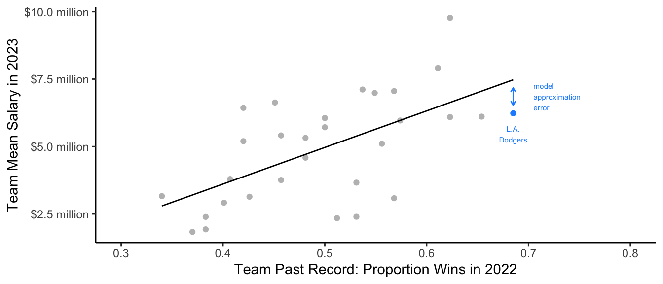
How can we solve model approximation error? One might replace the linear term team_past_record with a series of categories for team in the OLS model.
ols_team_categories <- lm(
  salary ~ team,
  data = baseball_sample
)
But because the sample contains only 5 players per team, these estimates are quite noisy.
Code
# Create many sample estimates with categorical teams
many_sample_estimates_categories <- foreach(
  repetition = 1:100, .combine = "c"
) %do% {
  # Draw a sample from the population
  baseball_sample <- baseball_population |>
    group_by(team) |>
    slice_sample(n = 5) |>
    ungroup()
  # Apply the estimator to the sample# Learn a model in the sample
  ols <- lm(
    salary ~ team,
    data = baseball_sample
  )
  # Predict for our target population
  ols_predicted <- dodgers_to_predict |>
    mutate(predicted_salary = predict(ols, newdata = dodgers_to_predict))
  # Average over the target population
  ols_estimate <- ols_predicted |>
    summarize(ols_estimate = mean(predicted_salary)) |>
    pull(ols_estimate)
  # Return the estimate
  return(ols_estimate)
}
# Visualize
tibble(x = "OLS linear in\nteam past record", y = many_sample_estimates) |>
  bind_rows(
    tibble(x = "OLS with categorical\nteam indicators", y = many_sample_estimates_categories)
  ) |>
  ggplot(aes(x = x, y = y)) +
  geom_jitter(width = .2, height = 0) +
  scale_y_continuous(
    name = "Dodger Mean Salary",
    labels = label_currency(
      scale = 1e-6, accuracy = .1, suffix = " million"
    )
  ) +
  theme_minimal() +
  scale_x_discrete(
    name = "Estimator"
  ) +
  ggtitle(NULL, subtitle = "Each dot is an estimate in one sample from the population") +
  geom_hline(yintercept = true_dodger_mean, linetype = "dashed") +
  annotate(geom = "text", x = .4, y = true_dodger_mean, hjust = 0, vjust = .5, label = "Truth in\npopulation", size = 3)
We would like to make the model more flexible to reduce model approximation error, while also avoiding high variance. To balance these competing objectives, we need a new strategy from machine learning.
A big idea: Regularization
Regularization encompasses a broad class of approaches designed for models that have many parameters, such as a unique intercept for every team in Major League Baseball. Regularization allows us to estimate many parameters while pulling them toward some common value in order to reduce the high variance that tends to results.
As one concrete example of regularization, we might want a middle ground between two extremes:
- our OLS linear prediction: \(\hat{Y}^\text{Linear}_\text{Dodgers} = \hat\alpha + \hat\beta\text{(Past Record)}_\text{Dodgers}={}\) $3.9 million
- the mean of the 5 sampled Dodger salaries: \(\hat{Y}^\text{Nonparametric}_\text{Dodgers} = {}\) $7.9 million
A regularized estimator could be a weighted average of these two, with weight \(w\) placed on the nonparametric mean and weight \(1 - w\) placed on the linear prediction.
\[ \hat\tau = w \hat{Y}^\text{Nonparametric}_\text{Dodgers} + (1 - w)\hat{Y}^\text{Linear}_\text{Dodgers} \] The graph below visualizes the resulting estimate at various values of \(w\). The regularized estimates are partially pooled toward the linear model prediction, with the amount of pooling controlled by \(w\).
Code
estimates_by_w <- foreach(w_value = seq(0,1,.05), .combine = "rbind") %do% {
  tibble(
    w = w_value,
    estimate = (1 - w) * dodger_sample_mean + w * ols_estimate
  )
}
estimates_by_w |>
  ggplot(aes(x = w, y = estimate)) +
  geom_point() +
  geom_line() +
  geom_text(
    data = estimates_by_w |>
      filter(w %in% c(0,1)) |>
      mutate(
        w = w + c(1,-1) * .13,
        hjust = c(0,1),
        label = c("Nonparametric Dodger Sample Mean",
                  "Linear Prediction from OLS")
      ),
    aes(label = label, hjust = hjust)
  ) +
  geom_segment(
     data = estimates_by_w |>
      filter(w %in% c(0,1)) |>
       mutate(x = w + c(1,-1) * .12,
              xend = w + c(1,-1) * .04),
     aes(x = x, xend = xend),
     arrow = arrow(length = unit(.08,"in"))
  ) +
  annotate(
    geom = "text", x = .3, y = estimates_by_w$estimate[12],
    label = "Partial\nPooling\nEstimates",
    vjust = 1
  ) +
  annotate(
    geom = "segment",
    x = c(.3,.4),
    xend = c(.3,.55),
    y = estimates_by_w$estimate[c(11,14)],
    yend = estimates_by_w$estimate[c(8,14)],
    arrow = arrow(length = unit(.08,"in"))
  ) +
  scale_x_continuous("Weight: Amount of Shrinkage Toward Linear Fit") +
  scale_y_continuous(
    labels = label_currency(
      scale = 1e-6, accuracy = .1, suffix = " million"
    ),
    name = "Dodger Mean Salary Estimates",
    expand = expansion(mult =.1)
  ) +
  theme_minimal()
Partial pooling is one way to navigate the bias-variance tradeoff: it allows us to have a flexible model while reducing the high amount of variance that such a model can create. In our case, the best estimator lies somewhere between the fully-pooled estimator (linear regression) and the fully-separate estimator (unique intercepts for each team).
One way to formally investigate the properties of our estimator is by defining a concept known as expected squared error. Let \(\hat\mu_\text{Dodgers}\) be an estimator: a function that when applied to a sample \(S\) returns an estimate \(\hat\mu_\text{Dodgers}(S)\). The squared error of this estimator in a particular sample \(S\) is \((\hat\mu_\text{Dodgers}(S) - \mu_\text{Dodgers})^2\). Expected squared error is the expected value of this performance taken across repeated samples \(S\) from the population.
\[ \text{Expected Squared Error}(\hat\mu_\text{Dodgers}) = \text{E}_S\left(\left(\hat\mu_\text{Dodgers}(S) - \mu_\text{Dodgers}\right)^2\right) \]
Ordinarily, one has only one sample and cannot directly calculate expected squared error. But our setting is useful for pedagogical purposes because we have the full population of baseball players and can repeatedly draw samples to evaluate performance. Below, we simulate \(r = 1,\dots,100\) repeated samples and estimated expected squared error by the mean squared error of the estimates \(\hat\mu_\text{Dodgers}(S_r)\) that we get from each simulated sample \(S_r\).
\[ \widehat{\text{Expected Squared Error}}(\hat\mu_\text{Dodgers}) = \frac{1}{100}\sum_{r=1}^{100}\left(\hat\mu_\text{Dodgers}(S_r) - \mu_\text{Dodgers}\right)^2 \]
Code
repeated_simulations <- foreach(rep = 1:100, .combine = "rbind") %do% {

  a_sample <- baseball_population |>
    group_by(team) |>
    slice_sample(n = 5) |>
    ungroup()

  ols_fit <- lm(salary ~ team_past_record, data = a_sample)

  ols_estimate <- predict(
    ols_fit,
    newdata = baseball_population |>
      filter(team == "L.A. Dodgers") |>
      distinct(team_past_record)
  )

  nonparametric_estimate <- a_sample |>
    filter(team == "L.A. Dodgers") |>
    summarize(salary = mean(salary)) |>
    pull(salary)

  foreach(w_value = seq(0,1,.05), .combine = "rbind") %do% {
    tibble(
      w = w_value,
      estimate = w * ols_estimate + (1 - w) * nonparametric_estimate
    )
  }
}

aggregated <- repeated_simulations |>
  group_by(w) |>
  summarize(mse = mean((estimate - true_dodger_mean) ^ 2)) |>
  mutate(best = mse == min(mse))

aggregated |>
  ggplot(aes(x = w, y = mse, color = best)) +
  geom_line() +
  geom_point() +
  scale_y_continuous(name = "Expected Squared Error\nfor Dodger Mean Salary") +
  scale_x_continuous(name = "Weight: Amount of Shrinkage Toward Linear Fit") +
  scale_color_manual(values = c("black","dodgerblue")) +
  geom_vline(xintercept = c(0,1), linetype = "dashed") +
  theme_minimal() +
  theme(legend.position = "none") +
  annotate(
    geom = "text",
    x = c(0.02,.98),
    y = range(aggregated$mse),
    hjust = c(0,1), vjust = c(0,1),
    size = 3,
    label = c(
      "Nonparametric estimator:\nDodger mean salary",
      "Model-based estimator:\nOLS linear prediction"
    )
  ) +
  annotate(
    geom = "text",
    x = aggregated$w[aggregated$best],
    y = min(aggregated$mse) + .2 * diff(range(aggregated$mse)),
    vjust = -.1,
    label = "Best-Performing\nEstimator",
    size = 3,
    color = "dodgerblue"
  ) +
  annotate(
    geom = "segment",
    x = aggregated$w[aggregated$best],
    y = min(aggregated$mse) + .18 * diff(range(aggregated$mse)),
    yend = min(aggregated$mse) + .05 * diff(range(aggregated$mse)),
    arrow = arrow(length = unit(.08,"in")),
    color = "dodgerblue"
  )
In this illustration, the best performance is an estimator that puts 75% of the weight on the linear fit and 25% of the weight on the mean among the 5 sampled Dodgers.
The example above illustrates an idea known as regularization, shrinkage, or partial pooling: we may often want to combine an estimate on a subgroup (the Dodger mean) with an estimate made on the full population (the linear fit). We will consider various methods to accomplish regularization, and we will return at the end to consider connections among them.
Multilevel models
Multilevel models1 are an algorithm for prediction that is fully grounded in classical statistics. They are especially powerful for the problem depicted above: making predictions when there are many groups (teams) with a small sample size in each group.
We will first illustrate a multilevel model’s performance and then consider the statistics behind this model. We will estimate using the lme4 package. If you don’t have this package, install it with install.packages("lme4").
library(lme4)In the syntax, the code (1 | team) says that our model should have a unique intercept for every team, and that these intercepts should be regularized (more on this soon).
multilevel <- lmer(salary ~ team_past_record + (1 | team), data = baseball_sample)We can make predictions from a multilevel model just like we can from OLS. For example, the code below makes predictions for the Dodgers.
multilevel_predicted <- dodgers_to_predict |>
  mutate(
    fitted = predict(multilevel, newdata = dodgers_to_predict)
  )
Intuition
The multilevel model is a partial-pooling estimator. The figure below displays this visually. For each team, the solid dot is the mean salary among the 5 sampled players. The ends of the arrows are the multilevel model estimates. The multilevel model pools the team-specific estimates toward the model-based prediction.
Code
p <- baseball_sample |>
  group_by(team) |>
  mutate(nonparametric = mean(salary)) |>
  ungroup() |>
  mutate(
    fitted = predict(multilevel)
  ) |>
  distinct(team, team_past_record, fitted, nonparametric) |>
  ungroup() |>
  ggplot(aes(x = team_past_record)) +
  geom_point(aes(y = nonparametric)) +
  geom_abline(
    intercept = fixef(multilevel)[1],
    slope = fixef(multilevel)[2],
    linetype = "dashed"
  ) +
  geom_segment(
    aes(y = nonparametric, yend = fitted),
    arrow = arrow(length = unit(.05,"in"))
  ) +
  geom_point(aes(y = nonparametric)) +
  #ggrepel::geom_text_repel(aes(y = fitted, label = team), size = 2) +
  theme_minimal() +
  scale_y_continuous(
    name = "Team Mean Salary in 2023",
    labels = label_currency(
      scale = 1e-6, accuracy = .1, suffix = " million"
    )
  ) +
  scale_x_continuous(name = "Team Past Record: Proportion Wins in 2022") +
  ggtitle("Multilevel model on a sample of 5 players per team",
          subtitle = "Points are nonparametric sample mean estimates.\nArrow ends are multilevel model estimates.\nDashed line is an unregularized fixed effect.")
p
The multilevel model only regularizes the team-specific estimates to the degree that they are imprecise. If we repeat the entire process on a sample of 20 players per team, each team-specific estimate becomes more precise and the overall amount of shrinkage is less.
Code
bigger_sample <- baseball_population |>
  group_by(team) |>
  slice_sample(n = 20) |>
  ungroup()
multilevel_big <- lmer(formula(multilevel), data = bigger_sample)
bigger_sample |>
  group_by(team) |>
  mutate(nonparametric = mean(salary)) |>
  ungroup() |>
  mutate(
    fitted = predict(multilevel_big)
  ) |>
  distinct(team, team_past_record, fitted, nonparametric) |>
  ungroup() |>
  ggplot(aes(x = team_past_record)) +
  geom_point(aes(y = nonparametric)) +
  geom_abline(
    intercept = fixef(multilevel)[1],
    slope = fixef(multilevel)[2],
    linetype = "dashed"
  ) +
  geom_segment(
    aes(y = nonparametric, yend = fitted),
    arrow = arrow(length = unit(.05,"in"))
  ) +
  geom_point(aes(y = nonparametric)) +
  #ggrepel::geom_text_repel(aes(y = fitted, label = team), size = 2) +
  theme_minimal() +
  scale_y_continuous(
    name = "Team Mean Salary in 2023",
    labels = label_currency(
      scale = 1e-6, accuracy = .1, suffix = " million"
    ),
    limits = layer_scales(p)$y$range$range
  ) +
  scale_x_continuous(name = "Team Past Record: Proportion Wins in 2022") +
  ggtitle("Multilevel model on a sample of 20 players per team",
          subtitle = "Points are nonparametric sample mean estimates.\nArrow ends are multilevel model estimates.\nDashed line is an unregularized fixed effect.")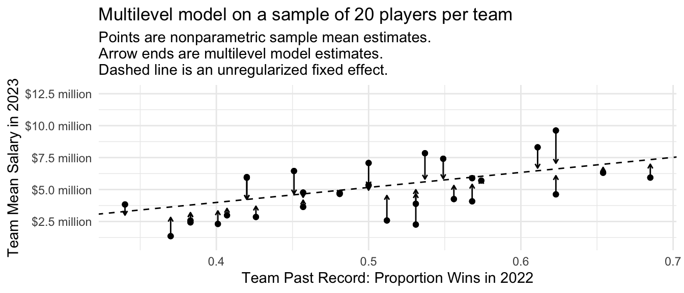
Performance over repeated samples
We previously discussed how an OLS prediction that was linear in the past team record was a biased estimator with low variance. The sample mean within each team was an unbiased estimator with high variance. The multilevel model falls in between these two extremes.
Code
many_sample_estimates_multilevel <- foreach(
  repetition = 1:100, .combine = "c"
) %do% {
  # Draw a sample from the population
  baseball_sample <- baseball_population |>
    group_by(team) |>
    slice_sample(n = 5) |>
    ungroup()
  # Apply the estimator to the sample# Learn a model in the sample
  multilevel <- lmer(
    salary ~ team_past_record + (1 | team),
    data = baseball_sample
  )
  # Predict for our target population
  mutilevel_predicted <- dodgers_to_predict |>
    mutate(predicted_salary = predict(multilevel, newdata = dodgers_to_predict))
  # Average over the target population
  mutilevel_estimate <- mutilevel_predicted |>
    summarize(mutilevel_estimate = mean(predicted_salary)) |>
    pull(mutilevel_estimate)
  # Return the estimate
  return(mutilevel_estimate)
}
# Visualize
tibble(x = "OLS with\nlinear record", y = many_sample_estimates) |>
  bind_rows(
    tibble(x = "OLS with\nteam indicators", y = many_sample_estimates_categories)
  ) |>
  bind_rows(
    tibble(x = "Multilevel\nmodel", y = many_sample_estimates_multilevel)
  ) |>
  ggplot(aes(x = x, y = y)) +
  geom_jitter(width = .2, height = 0) +
  scale_y_continuous(
    name = "Dodger Mean Salary",
    labels = label_currency(
      scale = 1e-6, accuracy = .1, suffix = " million"
    )
  ) +
  theme_minimal() +
  scale_x_discrete(
    name = "Estimator"
  ) +
  ggtitle(NULL, subtitle = "Each dot is an estimate in one sample from the population") +
  geom_hline(yintercept = true_dodger_mean, linetype = "dashed") +
  annotate(geom = "text", x = .4, y = true_dodger_mean, hjust = 0, vjust = .5, label = "Truth in\npopulation", size = 3)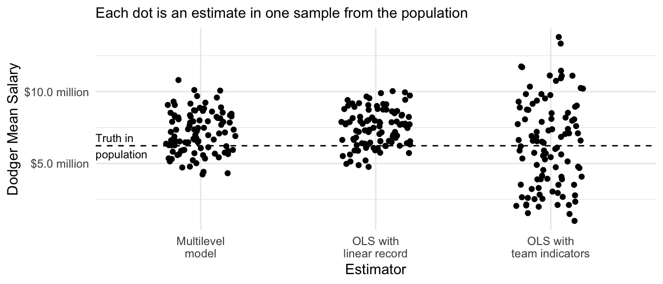
In math
Mathematically, a multilevel model is a maximum likelihood estimator. For our case, the model assumes that the salary of player \(i\) on team \(t\) is assumed to be normally distributed around the team mean salary \(\mu_t\), with variance \(\sigma^2\) which in our case is assumed to be the same across teams.
\[Y_{ti} \sim \text{Normal}\left(\mu_t, \sigma^2\right)\] The team-specific mean \(\mu_t\) involves two components. First, this mean is assumed to be centered at a linear prediction \(\alpha + X_t\beta\) where \(X_t\) is the win-loss record of team \(t\) in the previous year. This is the value toward which team-specific estimates are regularized. Second, the mean for the particular team \(i\) is drawn from a normal distribution with standard deviation \(\tau^2\), which is the standard deviation of the team-specific mean salary residuals across teams.
\[\mu_t \sim \text{Normal}(\alpha + X_t\beta, \tau^2)\] By maximizing the log likelihood of the observed data under this model, one comes to maximum likelihood estimates of all of the unknown parameters. The \(\mu_t\) estimates will partially pool between two estimators,
- the sample mean \(\bar{Y}_t\) within team \(t\)
- the linear model prediction \(\hat\alpha + X_t\hat\beta\)
where the weight on (1) will depend on the relative precision of this within-team estimate and the weight (2) will depend on the relative precision of the between-team estimate. After explaining ridge regression, we will return to a simplified case where the formula for the multilevel model estimates allows further intuition building.
Ridge regression
While multilevel models are often approached from the standpoint of classical statistics, they are very similar to another approach commonly approached from the standpoint of data science: ridge regression.
Intuition
Consider our sample of 30 baseball teams with 5 players per team. We might want to fit a linear regression model as follows,
\[ Y_{ij} = \alpha + \beta X_i + \gamma_{i} + \epsilon_{ij} \] where \(Y_{ij}\) is the salary of player \(i\) on team \(j\) and \(X_i\) is the past win-loss record of that team. In this model, \(\gamma_i\) is a team-specific deviation from the linear fit, which corrects for model approximation error that will arise if particular teams have average salaries not well-captured by the linear fit. The error term \(\epsilon_ij\) is the deviation for player \(j\) from their own team’s average salary.
The problem with this model is its high variance: with 30 teams, there are 30 different values of \(\gamma_i\) to be estimated. And there are only 5 players per team! We might believe that \(\gamma_i\) values will generally be small, so we might want to estimate by penalizing large values of \(\gamma_i\).
We can penalize large values of \(\gamma_i\) by an estimator written as it might be written in a data science course:
\[ \{\hat\alpha, \hat\beta, \hat{\vec\gamma}\} = \underset{\alpha,\beta,\vec\gamma}{\text{arg min}} \left[\sum_i\sum_j\left(Y_{ij} - \left(\alpha + \beta X_i + \gamma_{i}\right)\right)^2 + \lambda\sum_i\gamma_i^2\right] \]
where the estimated values \(\{\hat\alpha, \hat\beta, \hat{\vec\gamma}\}\) are chosen to minimize a loss function which is the sum over the data of the squared prediction error plus a penalty on large values of \(\gamma_i\).
In code
library(glmnet)ridge <- glmnet(
x = model.matrix(~ -1 + team_past_record + team, data = baseball_sample),
y = baseball_sample$salary,
penalty.factor = c(0,rep(1,30)),
# Choose the ridge penalty (alpha = 0).
# Later, we will learn about the LASSO penalty (alpha = 1)
alpha = 0
)We can visualize the ridge regression estimates just like the multilevel model estimates. Because the penalty applies to squared values of team deviations from the line, the points furthest from the line are most strongly regularized toward the line.
Code
baseball_sample |>
  group_by(team) |>
  mutate(nonparametric = mean(salary)) |>
  ungroup() |>
  mutate(
    fitted = predict(
      ridge,
      s = ridge$lambda[50],
      newx = model.matrix(~-1 + team_past_record + team, data = baseball_sample)
    )
  ) |>
  distinct(team, team_past_record, fitted, nonparametric) |>
  ungroup() |>
  ggplot(aes(x = team_past_record)) +
  geom_point(aes(y = nonparametric)) +
  geom_abline(
    intercept = coef(ridge, s = ridge$lambda[20])[1],
    slope = coef(ridge, s = ridge$lambda[20])[2],
    linetype = "dashed"
  ) +
  geom_segment(
    aes(y = nonparametric, yend = fitted),
    arrow = arrow(length = unit(.05,"in"))
  ) +
  geom_point(aes(y = nonparametric)) +
  #ggrepel::geom_text_repel(aes(y = fitted, label = team), size = 2) +
  theme_minimal() +
  scale_y_continuous(
    name = "Team Mean Salary in 2023",
    labels = label_currency(
      scale = 1e-6, accuracy = .1, suffix = " million"
    )
  ) +
  scale_x_continuous(name = "Team Past Record: Proportion Wins in 2022") +
  ggtitle("Ridge regression on a sample of 5 players per team",
          subtitle = "Points are nonparametric sample mean estimates.\nArrow ends are ridge regression estimates.\nDashed line is the unregularized component of the model.")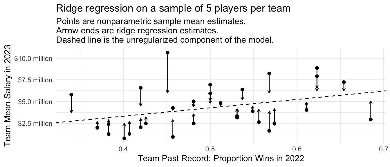
The amount of regularization will depend on the chosen value of the penalty parameter \(\lambda\). To the degree that \(\lambda\) is large, estimates will be more strongly pulled toward the regression line. Below is a visualization at three values of \(\lambda\).
Code
fitted <- predict(
  ridge,
  s = ridge$lambda[c(20,60,80)],
  newx = model.matrix(~-1 + team_past_record + team, data = baseball_sample)
)
colnames(fitted) <- c("Large Lambda Value","Medium Lambda Value","Small Lambda Value")
baseball_sample |>
  group_by(team) |>
  mutate(nonparametric = mean(salary)) |>
  ungroup() |>
  bind_cols(fitted) |>
  select(team, team_past_record, nonparametric, contains("Lambda")) |>
  pivot_longer(cols = contains('Lambda')) |>
  distinct() |>
  mutate(name = fct_rev(name)) |>
  ggplot(aes(x = team_past_record)) +
  geom_point(aes(y = nonparametric), size = .8) +
  geom_segment(
    aes(y = nonparametric, yend = value),
    arrow = arrow(length = unit(.04,"in"))
  ) +
  facet_wrap(~name) +
  #ggrepel::geom_text_repel(aes(y = fitted, label = team), size = 2) +
  theme_minimal() +
  scale_y_continuous(
    name = "Team Mean Salary in 2023",
    labels = label_currency(
      scale = 1e-6, accuracy = .1, suffix = " million"
    )
  ) +
  scale_x_continuous(name = "Team Past Record: Proportion Wins in 2022") +
  ggtitle("Ridge regression on a sample of 5 players per team",
          subtitle = "Points are nonparametric sample mean estimates.\nArrow ends are ridge regression estimates.\nDashed line is the unregularized component of the model.")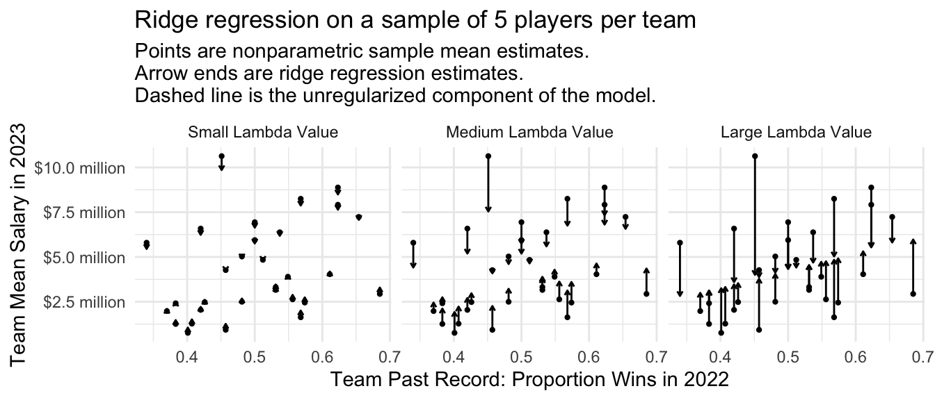
Focusing on the prediction for the Dodgers, we can see how the estimate changes as a function of the penalty parameter \(\lambda\).
Code
fitted <- predict(
  ridge,
  newx = model.matrix(~-1 + team_past_record + team, data = baseball_sample)
)
dodgers_sample_mean <- baseball_sample |>
  filter(team == "L.A. Dodgers") |>
  summarize(salary = mean(salary)) |>
  pull(salary)
ols_estimate <- predict(
  lm(salary ~ team_past_record, data = baseball_sample),
  newdata = baseball_sample |> filter(team == "L.A. Dodgers") |> slice_head(n = 1)
)
tibble(estimate = fitted[baseball_sample$team == "L.A. Dodgers",][1,],
       lambda = ridge$lambda) |>
  ggplot(aes(x = lambda, y = estimate)) +
  geom_line() +
  scale_y_continuous(
    name = "Dodger Mean Salary Estimate",
    labels = label_currency(
      scale = 1e-6, accuracy = .1, suffix = " million"
    ),
    expand = expansion(mult = .2)
  ) +
  scale_x_continuous(
    name = "Ridge Regression Penalty Term",
    limits = c(0,1e8)
  ) +
  annotate(
    geom = "point", x = 0, y = dodgers_sample_mean
  ) +
  annotate(geom = "segment", x = .85e7, xend = .2e7, y = dodgers_sample_mean,
           arrow = arrow(length = unit(.05,"in"))) +
  annotate(
    geom = "text", x = 1e7, y = dodgers_sample_mean,
    label = "Mean salary of 5 sampled Dodgers",
    hjust = 0, size = 3
  ) +
  geom_hline(yintercept = ols_estimate, linetype = "dashed") +
  annotate(
    geom = "text",
    x = 0, y = ols_estimate,
    label = "Dashed line = Prediction that does not allow any team-specific deviations",
    vjust = -.8, size = 3, hjust = 0
  ) +
  theme_minimal()
Warning: Removed 27 rows containing missing values or values outside the scale range
(`geom_line()`).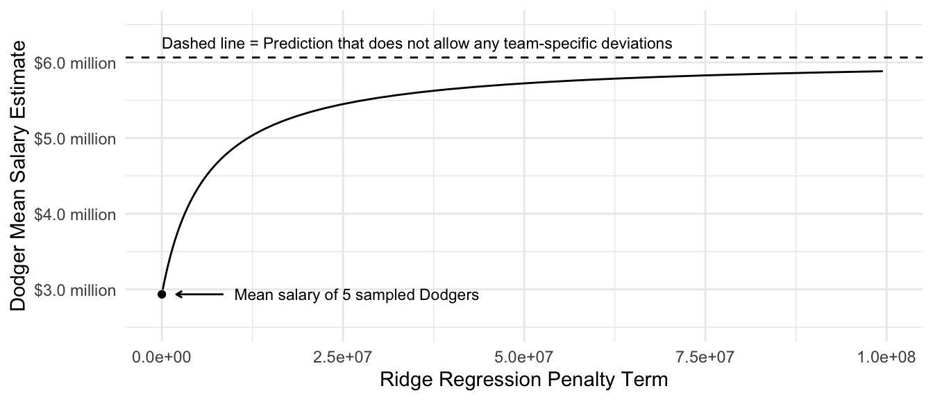
We will discuss how to choose the value of lambda more in two weeks when we discuss data-driven selection of an estimator.
Performance over repeated samples
The ridge regression estimator has intuitive performance across repeated samples: the variance of the estimates decreases as the value of the penalty parameter \(\lambda\) rises. The biase of the estimates also increases as the value of \(\lambda\) increases. The optimal value of \(\lambda\) is a problem-specific question that requires one to balance the tradeoff between bias and variance.
Code
many_sample_estimates_ridge <- foreach(
  repetition = 1:100, .combine = "rbind"
) %do% {
  # Draw a sample from the population
  baseball_sample <- baseball_population |>
    group_by(team) |>
    slice_sample(n = 5) |>
    ungroup()
  # Apply the estimator to the sample# Learn a model in the sample
  ridge <- glmnet(
    x = model.matrix(~ -1 + team_past_record + team, data = baseball_sample),
    y = baseball_sample$salary,
    penalty.factor = c(0,rep(1,30)),
    alpha = 0
  )
  # Predict for our target population
  fitted <- predict(
    ridge,
    s = ridge$lambda[c(20,60,80)],
    newx = model.matrix(~-1 + team_past_record + team, data = baseball_sample)
  )
  colnames(fitted) <- c("Large Lambda Value","Medium Lambda Value","Small Lambda Value")

  as_tibble(
    as.matrix(fitted[baseball_sample$team == "L.A. Dodgers",][1,]),
    rownames = "estimator"
  ) |>
    rename(estimate = V1)
}
# Visualize
many_sample_estimates_ridge |>
  mutate(estimator = fct_rev(estimator)) |>
  ggplot(aes(x = estimator, y = estimate)) +
  geom_jitter(width = .2, height = 0) +
  scale_y_continuous(
    name = "Dodger Mean Salary",
    labels = label_currency(
      scale = 1e-6, accuracy = .1, suffix = " million"
    )
  ) +
  theme_minimal() +
  scale_x_discrete(
    name = "Estimator"
  ) +
  ggtitle(NULL, subtitle = "Each dot is an estimate in one sample from the population") +
  geom_hline(yintercept = true_dodger_mean, linetype = "dashed") +
  annotate(geom = "text", x = .4, y = true_dodger_mean, hjust = 0, vjust = .5, label = "Truth in\npopulation", size = 3)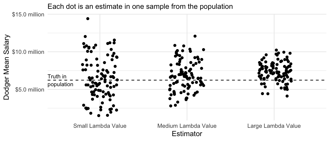
Connections: Multilevel model and ridge regression
Multilevel models and ridge regression are closely connected, and they can yield mathematically equivalent estimates in special cases. Consider again the multilevel model for the salary \(Y_{ti}\) of player \(i\) on team \(t\).
\[ \begin{aligned} Y_{ti} &\sim \text{Normal}(\mu_t,\sigma^2) \\ \mu_t &\sim \text{Normal}(\mu_0, \tau^2) \end{aligned} \] For simplicity, suppose we already have estimates \(\hat\mu_0\), \(\hat\tau^2\), and \(\hat\sigma^2\). One can show that the multilevel model estimates of \(\mu_t\) are:
\[ \hat\mu_t^\text{Multilevel} = \frac{\sum_{i}Y_{ti} + \frac{\hat\sigma^2}{\hat\tau^2}\hat\mu_0}{n_t + \frac{\hat\sigma^2}{\hat\tau^2}} \] This formula can be interpreted as analogous to a sample mean, but with some added observations. The first part of the numerator and denominator corresponds to a sample mean: the sum \(\sum_i Y_{ti}\) of salaries of all sampled players in team \(t\) in the numerator and the number of such players \(n_t\) in the denominator. The right side of the numerator and denominator correspond to pseudo-observations. It is as though in addition to the sampled players, we also saw \(\frac{\hat\sigma^2}{\hat\tau^2}\) additional players with exactly the overall baseball mean salary estimate \(\hat\mu_0\). This part of the formula partially pools the team-specific mean toward this overall mean. Partial pooling is greater to the degree that there is small within-team variance (small \(\sigma^2\)) or large across-team variance (large \(\hat\tau^2\)).
Next, we consider a ridge regression estimator that minimizes an objective function where \(\hat\mu_0\) is an unpenalized estimate for the baseball-wide mean salary.2
\[ \hat{\vec\mu}^\text{Ridge} = \underset{\vec\mu}{\text{arg min}} \underbrace{\sum_t\sum_i \left(Y_{it}-\mu_t\right)^2}_\text{Sum of Squared Error} + \underbrace{\lambda\sum_t \left(\mu_t - \hat\mu_0\right)^2}_\text{Penalty} \] We can gain some additional intuition for this estimate by rearranging to pull the penalty into the main term.
\[ \hat{\vec\mu}^\text{Ridge} = \underset{\vec\mu}{\text{arg min}} \sum_t\left(\sum_i \left(Y_{it}-\mu_t\right)^2 + \lambda\left(\hat\mu_0 - \mu_t\right)^2\right) \] The first part of this term is the sum over observed squared errors within team \(t\), \(\sum_i\left(Y_{it}-\mu_t\right)^2\). The second part is as though we had observed an additional \(\lambda\) cases within team \(t\) with an outcome value \(\mu_0\) equal to the baseball-wide mean. With this intuition, the ridge regression estimator becomes
\[ \hat\mu_t^\text{Ridge} = \frac{\sum_i Y_{it} + \lambda\hat\mu_0}{n_t + \lambda} \] which is the same as the multilevel model estimator in the special case when \(\lambda = \frac{\hat\sigma^2}{\hat\tau^2}\). Multilevel models and ridge regression are actually accomplishing the same thing!
Below, we use code to check that these two give the same thing. We first fit a multilevel model,
multilevel <- lmer(salary ~ 1 + (1 | team), data = baseball_sample)Then we make predictions,
yhat_multilevel <- baseball_sample |>
  mutate(yhat_multilevel = predict(multilevel)) |>
  distinct(team, yhat_multilevel)
and extract the implied value of \(\lambda\) for an equivalent ridge regression (from the math above).
lambda_equivalent <- as_tibble(VarCorr(multilevel)) |>
  select(grp, vcov) |>
  pivot_wider(names_from = "grp", values_from = "vcov") |>
  mutate(lambda_equivalent = Residual / team) |>
  pull(lambda_equivalent)
Now we estimate ridge regression with that \(\lambda\) value. Because glmnet internally rescales variables, it is difficult to carry out this check with glmnet. Instead, we will write our own ridge regression estimator. We first define our predictor matrix X and a mean-centered outcome vector y_centered. The reason to mean-center the outcome is to allow an unpenalized grand mean (\(\mu_0\) in the math above). We will add this value back to predictions later.
X <- model.matrix(~ -1 + team, data = baseball_sample)
y_centered <- baseball_sample$salary - mean(baseball_sample$salary)
The ridge regression estimator can be written in matrix form as follows:
\[ Y - \hat\mu_0 = \mathbf{X}\vec\beta + \epsilon \] with \(\hat{\vec\beta}_\text{Ridge} = (\mathbf{X}'\mathbf{X} + \text{diag}(\lambda))^{-1}\mathbf{X}'\vec{Y}\). The code below estimates \(\vec\beta\)
beta_ridge <- solve(
  t(X) %*% X + diag(rep(lambda_equivalent,ncol(X))),
  t(X) %*% y_centered
)
Because there is one \(\beta\) value for each team, we convert to predicted values for each team by adding the grand mean to the estimated coefficients.
yhat_ridge <- beta_ridge + mean(baseball_sample$salary)Finally, we create a tibble with both the ridge regression and multilevel model estimates.
both_estimators <- as_tibble(rownames_to_column(data.frame(yhat_ridge))) |>
  rename(team = rowname) |>
  mutate(team = str_remove(team,"team")) |>
  left_join(yhat_multilevel, by = join_by(team))
We can confirm in code that the two predictions are numerically equal.
both_estimators |>
  # remove names; it is ok if names are unequal
  mutate_all(unname) |>
  # summarize whether the two columns are equal
  summarize(numerically_equal = all.equal(yhat_ridge, yhat_multilevel))
# A tibble: 1 × 1
numerically_equal
<lgl>
1 TRUE We produce a plot with one point for each team, with ridge regression predictions on the \(x\)-axis and multilevel model predictions on the \(y\)-axis. We can see that these two estimators are equivalent.
Code
both_estimators |>
  ggplot(aes(x = yhat_ridge, y = yhat_multilevel, label = team)) +
  geom_abline(intercept = 0, slope = 1) +
  geom_point() +
  scale_x_continuous(
    name = "Ridge Regression",
    labels = label_currency(
      scale = 1e-6, accuracy = .1, suffix = " million"
    )
  ) +
  scale_y_continuous(
    name = "Multilevel Model",,
    labels = label_currency(
      scale = 1e-6, accuracy = .1, suffix = " million"
    )
  ) +
  ggtitle("Ridge regression and multilevel models can yield\nequal estimates for the mean salary on each team") +
  theme_minimal()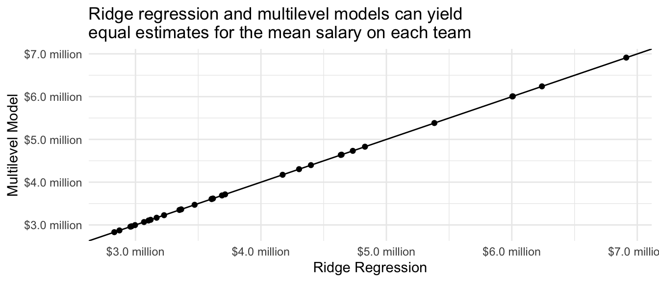
The equivalency of ridge regression and multilevel models may be surprising. Ridge regression is often motivated from a loss function (squared error + penalty), using terms that are common in data science and machine learning. Multilevel models are often motivated from sociological examples where units are clustered in groups, with terminology more common in statistics. Yet the two are mathematically related. An important difference is that multilevel models learn the amount of regularization from the data, whereas ridge regression needs an additional step to learn the penalty parameter (to be discussed in a future class session on data-driven estimator selection).
LASSO regression
LASSO regression is just like ridge regression except for one key difference: instead of penalizing the sum of squared coefficients, LASSO penalizes the sum of the absolute value of coefficients. As we will see, this change means that some parameters become regularized all the way to zero so that some terms drop out of the model completely.
As with ridge regression, our outcome model is
\[ Y_{ti} = \alpha + \beta X_t + \gamma_{t} + \epsilon_{ti} \] where \(Y_{ti}\) is the salary of player \(i\) on team \(t\) and \(X_t\) is the past win-loss record of that team. In this model, \(\gamma_t\) is a team-specific deviation from the linear fit, which corrects for model approximation error that will arise if particular teams have average salaries not well-captured by the linear fit. The error term \(\epsilon_{ti}\) is the deviation for player \(i\) from their own team’s average salary.
To solve the high-variance estimates of \(\gamma_t\), LASSO regression uses a different penalty term in its loss function:
\[ \{\hat\alpha, \hat\beta, \hat{\vec\gamma}\} = \underset{\alpha,\beta,\vec\gamma}{\text{arg min}} \left[\sum_t\sum_i\left(Y_{ti} - \left(\alpha + \beta X_t + \gamma_{t}\right)\right)^2 + \lambda\sum_t\lvert\gamma_t\rvert\right] \]
where \(\gamma_t^2\) from the ridge regression penalty has been replaced by the absolute value \(\lvert\gamma_t\rvert\). We will first apply this in code and then see how it changes the performance of the estimator.
In code
library(glmnet)lasso <- glmnet(
x = model.matrix(~ -1 + team_past_record + team, data = baseball_sample),
y = baseball_sample$salary,
penalty.factor = c(0,rep(1,30)),
# Choose LASSO (alpha = 1) instead of ridge (alpha = 0)
alpha = 1
)Visualizing the estimates, we see behavior similar to what we have previously seen from multilevel models and ridge regression. All estimates are pulled toward a linear regression fit. There are two key differences, however.
First, the previous estimators most strongly pulled the large deviations toward the linear fit. The LASSO estimates pull all parameter estimates toward the linear fit to a similar degree, regardless of their size. This is because the LASSO estimates penalize the absolute value of \(\gamma_i\) instead of the squared value of \(\gamma_i\).
Second, the multilevel and ridge estimates never pulled any of the estimates all the way to the line; instead, the estimates asymptoted toward the line as the penalty parameter grew. In LASSO, some estimates are pulled all the way to the line.
Code
baseball_sample |>
  group_by(team) |>
  mutate(nonparametric = mean(salary)) |>
  ungroup() |>
  mutate(
    fitted = predict(
      lasso,
      s = lasso$lambda[20],
      newx = model.matrix(~-1 + team_past_record + team, data = baseball_sample)
    )
  ) |>
  distinct(team, team_past_record, fitted, nonparametric) |>
  ungroup() |>
  ggplot(aes(x = team_past_record)) +
  geom_point(aes(y = nonparametric)) +
  geom_abline(
    intercept = coef(lasso, s = lasso$lambda[20])[1],
    slope = coef(lasso, s = lasso$lambda[20])[2],
    linetype = "dashed"
  ) +
  geom_segment(
    aes(y = nonparametric, yend = fitted),
    arrow = arrow(length = unit(.05,"in"))
  ) +
  geom_point(aes(y = nonparametric)) +
  #ggrepel::geom_text_repel(aes(y = fitted, label = team), size = 2) +
  theme_minimal() +
  scale_y_continuous(
    name = "Team Mean Salary in 2023",
    labels = label_currency(
      scale = 1e-6, accuracy = .1, suffix = " million"
    )
  ) +
  scale_x_continuous(name = "Team Past Record: Proportion Wins in 2022") +
  ggtitle("LASSO regression on a sample of 5 players per team",
          subtitle = "Points are nonparametric sample mean estimates.\nArrow ends are ridge regression estimates.\nDashed line is the unregularized component of the model.")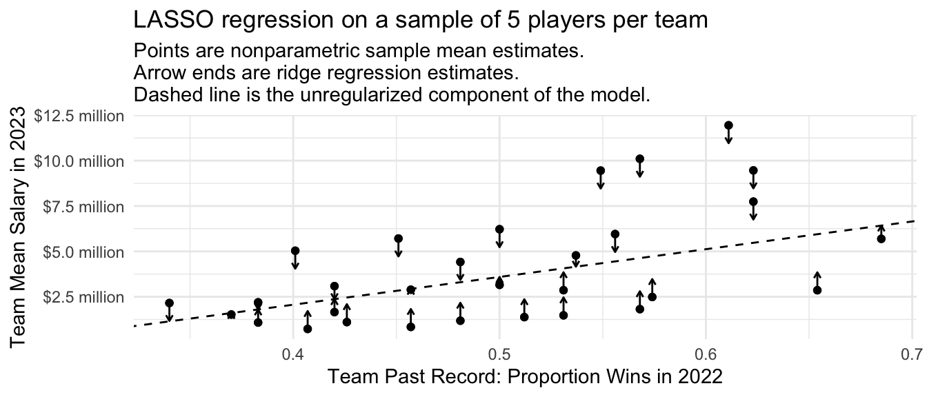
Focusing on the prediction for the Dodgers, we can see how the estimate changes as a function of the penalty parameter \(\lambda\). At a very small penalty, the estimate is approximately the same as the mean among the 5 sampled Dodger players. As the penalty parameter \(\lambda\) gets larger, the estimates move around. They generally move toward zero, but not always: as some other team-specific deviations are pulled to zero, the unregularized intercept and slope on team past record move around in response. Ultimately, the penalty becomes so large that the Dodger estimate is regularized all the way to the estimate we would get in a model with no team-specific deviations.
Code
fitted <- predict(
  lasso,
  newx = model.matrix(~-1 + team_past_record + team, data = baseball_sample)
)
dodgers_sample_mean <- baseball_sample |>
  filter(team == "L.A. Dodgers") |>
  summarize(salary = mean(salary)) |>
  pull(salary)
ols_estimate <- predict(
  lm(salary ~ team_past_record, data = baseball_sample),
  newdata = baseball_sample |> filter(team == "L.A. Dodgers") |> slice_head(n = 1)
)
tibble(estimate = fitted[baseball_sample$team == "L.A. Dodgers",][1,],
       lambda = lasso$lambda) |>
  ggplot(aes(x = lambda, y = estimate)) +
  geom_line() +
  scale_y_continuous(
    name = "Dodger Mean Salary Estimate",
    labels = label_currency(
      scale = 1e-6, accuracy = .1, suffix = " million"
    ),
    expand = expansion(mult = .2)
  ) +
  scale_x_continuous(
    name = "LASSO Regression Penalty Term",
    limits = c(0,2.5e6)
  ) +
  annotate(
    geom = "point", x = 0, y = dodgers_sample_mean
  ) +
  annotate(geom = "segment", x = 2.5e5, xend = 1e5, y = dodgers_sample_mean,
           arrow = arrow(length = unit(.05,"in"))) +
  annotate(
    geom = "text", x = 3e5, y = dodgers_sample_mean,
    label = "Mean salary of 5 sampled Dodgers",
    hjust = 0, size = 3
  ) +
  geom_hline(yintercept = ols_estimate, linetype = "dashed") +
  annotate(
    geom = "text",
    x = 0, y = ols_estimate,
    label = "Dashed line = Prediction that does not allow any team-specific deviations",
    vjust = -.8, size = 3, hjust = 0
  ) +
  theme_minimal()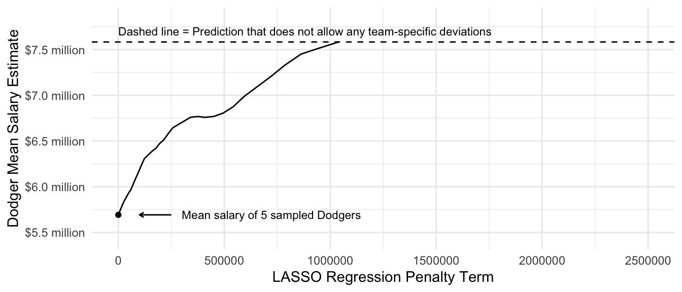
As with ridge regression, we will discuss how to choose the value of lambda more in two weeks when we discuss data-driven selection of an estimator.
Performance over repeated samples
Similar to the ridge regression estimator, we can visualize the performance of the LASSO regression estimator across repeated samples from the population.
Code
many_sample_estimates_lasso <- foreach(
  repetition = 1:100, .combine = "rbind"
) %do% {
  # Draw a sample from the population
  baseball_sample <- baseball_population |>
    group_by(team) |>
    slice_sample(n = 5) |>
    ungroup()
  # Apply the estimator to the sample# Learn a model in the sample
  lasso <- glmnet(
    x = model.matrix(~ -1 + team_past_record + team, data = baseball_sample),
    y = baseball_sample$salary,
    penalty.factor = c(0,rep(1,30)),
    alpha = 1
  )
  # Predict for our target population
  fitted <- predict(
    lasso,
    s = lasso$lambda[c(15,30,45)],
    newx = model.matrix(~-1 + team_past_record + team, data = baseball_sample)
  )
  colnames(fitted) <- c("Large Lambda Value","Medium Lambda Value","Small Lambda Value")

  as_tibble(
    as.matrix(fitted[baseball_sample$team == "L.A. Dodgers",][1,]),
    rownames = "estimator"
  ) |>
    rename(estimate = V1)
}
# Visualize
many_sample_estimates_lasso |>
  mutate(estimator = fct_rev(estimator)) |>
  ggplot(aes(x = estimator, y = estimate)) +
  geom_jitter(width = .2, height = 0) +
  scale_y_continuous(
    name = "Dodger Mean Salary",
    labels = label_currency(
      scale = 1e-6, accuracy = .1, suffix = " million"
    )
  ) +
  theme_minimal() +
  scale_x_discrete(
    name = "Estimator"
  ) +
  ggtitle(NULL, subtitle = "Each dot is an estimate in one sample from the population") +
  geom_hline(yintercept = true_dodger_mean, linetype = "dashed") +
  annotate(geom = "text", x = .4, y = true_dodger_mean, hjust = 0, vjust = .5, label = "Truth in\npopulation", size = 3)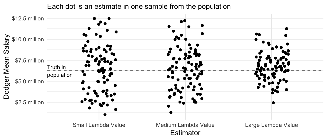
Trees
To read more on this topic, see Ch 8.4 of Efron & Hastie (2016)
Penalized regression performs well when the the response surface \(E(Y\mid\vec{X})\) is well-approximated by the functional form of a particular assumed model. In some settings, however, the response surface may be more complex, with nonlinearities and interaction terms that the researcher may not know about in advance. In these settings, one might desire an estimator that adaptively learns the functional form from the data.
A simulation to illustrate trees
As an example, the figure below presents some hypothetical data with a binary predictor \(Z\), a numeric predictor \(X\), and a numeric outcome \(Y\).
Code
true_conditional_mean <- tibble(z = F, x = seq(0,1,.001)) |>
  bind_rows(tibble(z = T, x = seq(0,1,.001))) |>
  mutate(mu = z * plogis(10 * (x - .5)))
simulate <- function(sample_size) {
  tibble(z = F, x = seq(0,1,.001)) |>
    bind_rows(tibble(z = T, x = seq(0,1,.001))) |>
    mutate(mu = z * plogis(10 * (x - .5))) |>
    slice_sample(n = sample_size, replace = T) |>
    mutate(y = mu + rnorm(n(), sd = .1))
}
simulated_data <- simulate(1000)
p_no_points <- true_conditional_mean |>
  ggplot(aes(x = x, color = z, y = mu)) +
  geom_line(linetype = "dashed", size = 1.2) +
  labs(
    x = "Numeric Predictor X",
    y = "Numeric Outcome Y",
    color = "Binary Predictor Z"
  ) +
  theme_bw()
p <- p_no_points +
  geom_point(data = simulated_data, aes(y = y), size = .2, alpha = .3)
p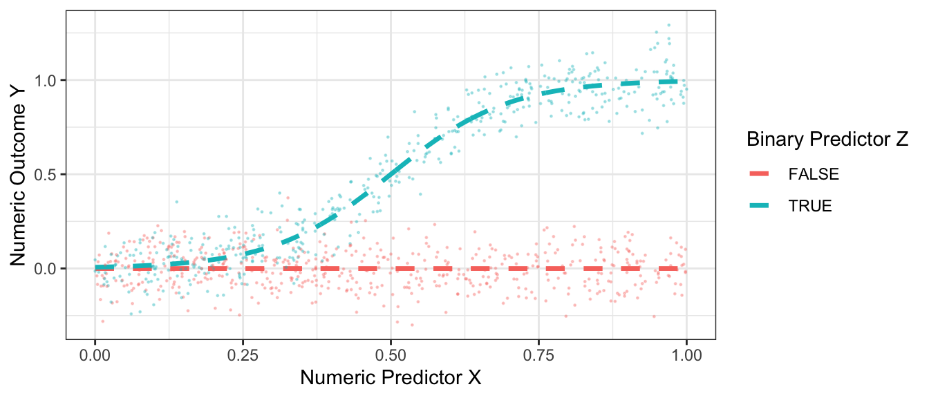
If we tried to approximate these conditional means with an additive linear model, \[\hat{E}_\text{Linear}(Y\mid X,Z) = \hat\alpha + \hat\beta X + \hat\gamma Z\] then the model approximation error would be very large.
Code
best_linear_fit <- lm(mu ~ x + z, data = true_conditional_mean)
p +
  geom_line(
    data = true_conditional_mean |>
      mutate(mu = predict(best_linear_fit))
  ) +
  theme_bw() +
  ggtitle("An additive linear model (solid lines) poorly approximates\nthe true conditional mean function (dashed lines)")
Trees repeatedly split the data
Regression trees begin from a radically different place. With no model at all, suppose we were to split the sample into two subgroups. For example, we might choose to split on \(Z\) and say that all units with z = TRUE are one subgroup while all units with z = FALSE are another subgroup. Or we might split on \(X\) and say that all units with x <= .23 are one subgroup and all units with x > .23 are another subgroup. After choosing a way to split the dataset into two subgroups, we would then make a prediction rule: for each unit, predict the mean value of all sampled units who fall in their subgroup. This rule would produce only two predicted values: one prediction per resulting subgroup.
If you were designing an algorithm to predict this way, how would you choose to define the split?
In regression trees to estimate conditional means, the split is often chosen to minimize the resulting sum of squared prediction errors. Suppose we choose this rule. Suppose we consider splitting on \(X\) being above or below each decile of its empirical distribution. Suppose we consider splitting on \(Z\) being FALSE or TRUE. The graph below shows the sum of squared prediction error resulting from each rule.
Code
x_split_candidates <- quantile(simulated_data$x, seq(.1,.9,.1))
z_split_candidates <- .5
by_z <- simulated_data |>
  group_by(z) |>
  mutate(yhat = mean(y)) |>
  ungroup() |>
  summarize(sum_squared_error = sum((yhat - y) ^ 2))
by_x <- foreach(x_split = x_split_candidates, .combine = "rbind") %do% {
  simulated_data |>
    mutate(left = x <= x_split) |>
    group_by(left) |>
    mutate(yhat = mean(y)) |>
    ungroup() |>
    summarize(sum_squared_error = sum((yhat - y) ^ 2)) |>
    mutate(x_split = x_split)
}

by_x |>
  mutate(split = "If Splitting on X") |>
  rename(split_value = x_split) |>
  bind_rows(
    by_z |>
      mutate(split = "If Splitting on Z") |>
      mutate(split_value = .5)
  ) |>
  ggplot(aes(x = split_value, y = sum_squared_error)) +
  geom_point() +
  geom_line() +
  facet_wrap(~split) +
  labs(
    x = "Value on Which to Split into Two Subgroups",
    y = "Resulting Sum of Squared Error"
  ) +
  theme_bw()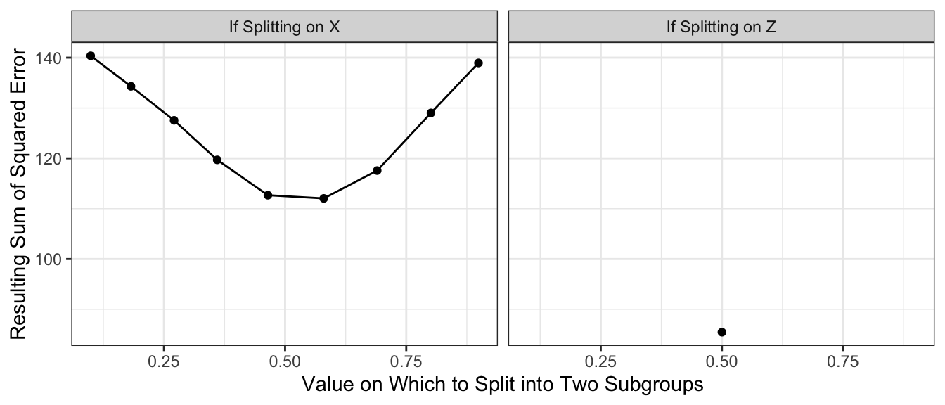
With the results above, we would choose to split on \(Z\), creating a subpopulation with \(Z \leq .5\) and a subgroup with \(Z\geq .5\). Our prediction function would look like this. Our split very well approximates the true conditional mean function when Z = FALSE, but is still a poor approximator when Z = TRUE.
Code
p +
  geom_line(
    data = simulated_data |>
      group_by(z) |>
      mutate(mu = mean(y))
  ) +
  ggtitle("Solid lines represent predicted values\nafter one split on Z")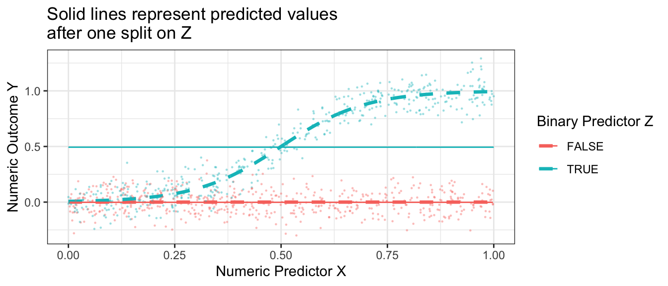
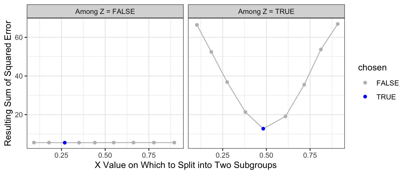
What if we make a second split? A regression tree repeats the process and considers making a further split within each subpopulation. The graph below shows the sum of squared error in the each subpopulation of Z when further split at various candidate values of X.
Code
# Split 2: After splitting by Z, only X remains on which to split
left_side <- simulated_data |> filter(!z)
right_side <- simulated_data |> filter(z)

left_split_candidates <- quantile(left_side$x, seq(.1,.9,.1))
right_split_candidates <- quantile(right_side$x, seq(.1,.9,.1))

left_split_results <- foreach(x_split = left_split_candidates, .combine = "rbind") %do% {
  left_side |>
    mutate(left = x <= x_split) |>
    group_by(z,left) |>
    mutate(yhat = mean(y)) |>
    ungroup() |>
    summarize(sum_squared_error = sum((yhat - y) ^ 2)) |>
    mutate(x_split = x_split)
} |>
  mutate(chosen = sum_squared_error == min(sum_squared_error))

right_split_results <- foreach(x_split = right_split_candidates, .combine = "rbind") %do% {
  right_side |>
    mutate(left = x <= x_split) |>
    group_by(z,left) |>
    mutate(yhat = mean(y)) |>
    ungroup() |>
    summarize(sum_squared_error = sum((yhat - y) ^ 2)) |>
    mutate(x_split = x_split)
} |>
  mutate(chosen = sum_squared_error == min(sum_squared_error))

split2_results <- left_split_results |> mutate(split1 = "Among Z = FALSE") |>
  bind_rows(right_split_results |> mutate(split1 = "Among Z = TRUE"))

split2_results |>
  ggplot(aes(x = x_split, y = sum_squared_error)) +
  geom_line(color = 'gray') +
  geom_point(aes(color = chosen)) +
  scale_color_manual(values = c("gray","blue")) +
  facet_wrap(~split1) +
  theme_bw() +
  labs(
    x = "X Value on Which to Split into Two Subgroups",
    y = "Resulting Sum of Squared Error"
  )
The resulting prediction function is a step function that begins to more closely approximate the truth.
Code
split2_for_graph <- split2_results |>
  filter(chosen) |>
  mutate(z = as.logical(str_remove(split1,"Among Z = "))) |>
  select(z, x_split) |>
  right_join(simulated_data, by = join_by(z)) |>
  mutate(x_left = x <= x_split) |>
  group_by(z, x_left) |>
  mutate(yhat = mean(y))

p +
  geom_line(
    data = split2_for_graph,
    aes(y = yhat)
  ) +
  ggtitle("Solid lines represent predicted values\nafter two splits on (Z,X)")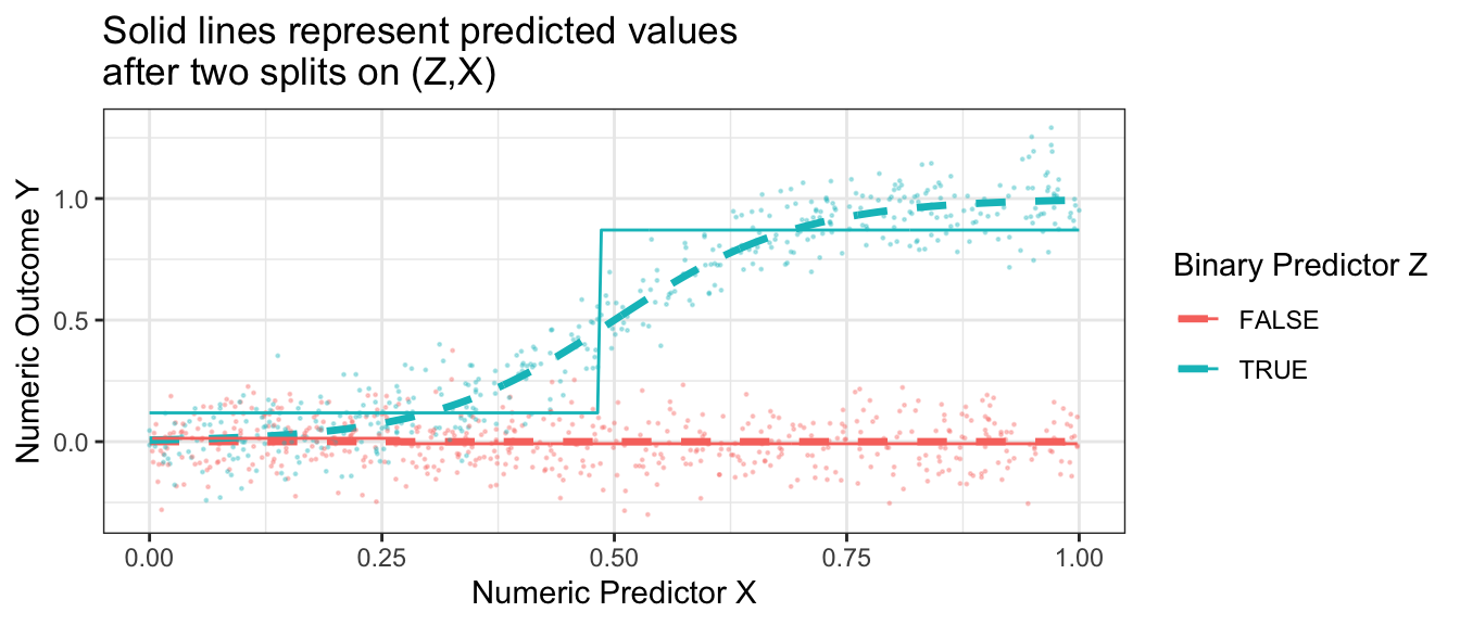
Having made one and then two splits, the figure below shows what happens when each subgroup is the created by 4 sequential splits of the data.
Code
library(rpart)
rpart.out <- rpart(
  y ~ x + z, data = simulated_data,
  control = rpart.control(minsplit = 2, cp = 0, maxdepth = 4)
)
p +
  geom_step(
    data = true_conditional_mean |>
      mutate(mu_hat = predict(rpart.out, newdata = true_conditional_mean)),
    aes(y = mu_hat)
  ) +
  ggtitle("Prediction from regression tree grown to depth 4")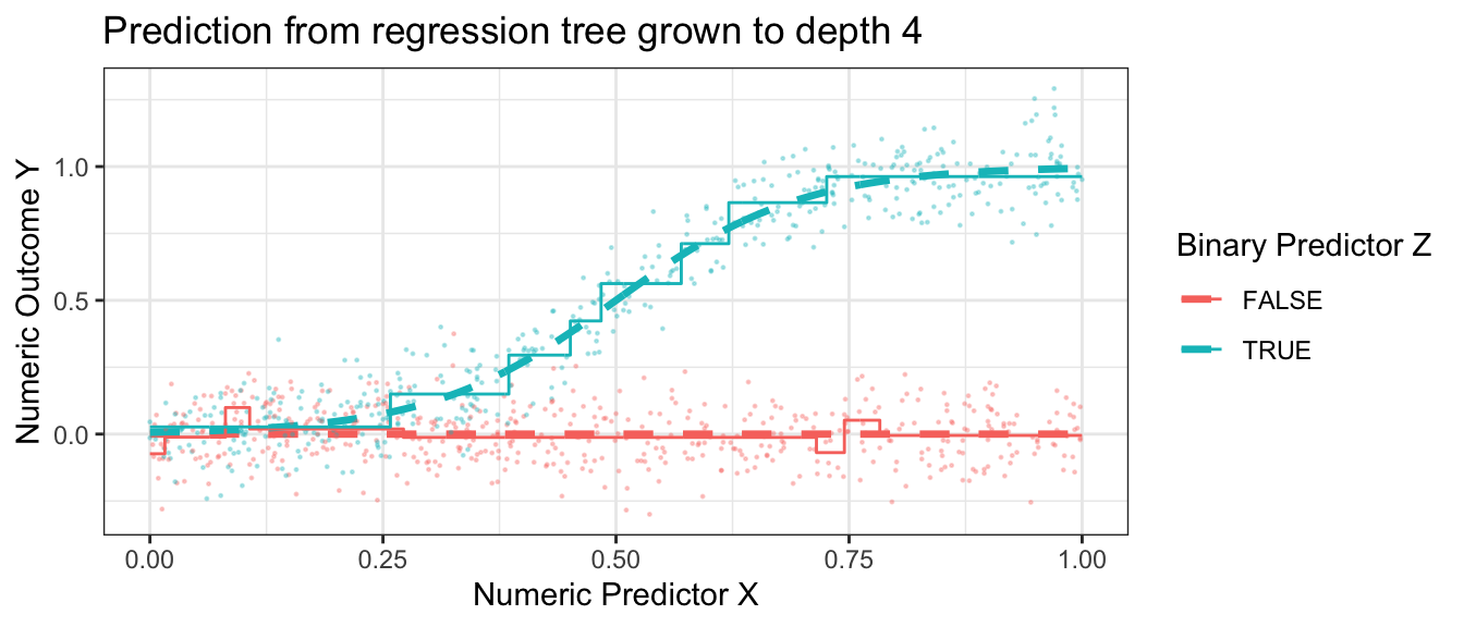
This prediction function is called a regression tree because of how it looks when visualized a different way. One begins with a full sample which then “branches” into a left and right part, which further “branch” off in subsequent splits. The terminal nodes of the tree—subgroups defined by all prior splits—are referred to as “leaves.” Below is the prediction function from above, visualized as a tree. This visualization is made possible with the rpart.plot package which we practice further down the page.
Code
library(rpart.plot)
rpart.plot::rpart.plot(rpart.out)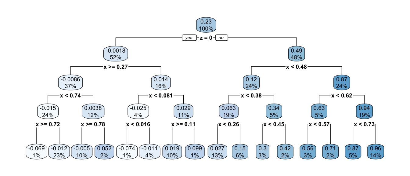
Your turn: Fit a regression tree
Using the rpart package, fit a regression tree like the one above. First, load the package.
library(rpart)Then use this code to simulate data. If you are a Stata user, download this simulated data file from the website.
simulate <- function(sample_size) {
  tibble(z = F, x = seq(0,1,.001)) |>
    bind_rows(tibble(z = T, x = seq(0,1,.001))) |>
    mutate(mu = z * plogis(10 * (x - .5))) |>
    slice_sample(n = sample_size, replace = T) |>
    mutate(y = mu + rnorm(n(), sd = .1))
}
simulated_data <- simulate(1000)
Use the rpart function to grow a tree.
rpart.out <- rpart(y ~ x + z, data = simulated_data)Finally, we can define a series of predictor values at which to make predictions,
to_predict <- tibble(z = F, x = seq(0,1,.001)) |>
    bind_rows(tibble(z = T, x = seq(0,1,.001)))
and then make predictions
predicted <- predict(rpart.out, newdata = to_predict)and visualize in a plot.
to_predict |>
  mutate(yhat = predicted) |>
  ggplot(aes(x = x, y = yhat, color = z)) +
  geom_step()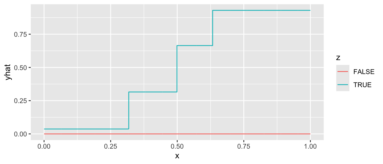
When you succeed, there are a few things you can try:
- Visualize the tree using the
rpart.plot()function applied to yourrpart.outobject - Attempt a regression tree using the
baseball_population.csvdata - Try different specifications of the tuning parameters. See the
controlargument ofrpart, explained at?rpart.control. To produce a model with depth 4, we previously used the argumentcontrol = rpart.control(minsplit = 2, cp = 0, maxdepth = 4).
Choosing the depth of the tree
How deep should one make a tree? Recall that the depth of the tree is the number of sequential splits that define a leaf. The figure below shows relatively shallow trees (depth = 2) and relatively deep trees (depth = 4) learned over repeated samples. What do you notice about performance with each choice?
Code
estimator <- function(maxdepth) {
  foreach(rep = 1:3, .combine = "rbind") %do% {
    this_sample <- simulate(100)
    rpart.out <- rpart(y ~ x + z, data = this_sample, control = rpart.control(minsplit = 2, cp = 0, maxdepth = maxdepth))
    true_conditional_mean |>
      mutate(yhat = predict(rpart.out, newdata = true_conditional_mean),
             maxdepth = maxdepth,
             rep = rep)
  }
}
results <- foreach(maxdepth_value = c(2,5), .combine = "rbind") %do% estimator(maxdepth = maxdepth_value)
p_no_points +
  geom_line(
    data = results |> mutate(maxdepth = case_when(maxdepth == 2 ~ "Shallow Trees\nDepth = 2", maxdepth == 5 ~ "Deep Trees\nDepth = 5")),
    aes(group = interaction(z,rep), y = yhat)
  ) +
  facet_wrap(
    ~maxdepth
  )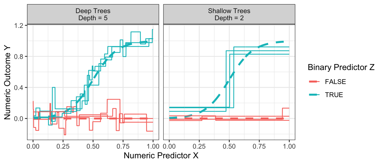
Shallow trees yield predictions that tend to be more biased because the terminal nodes are large. At the far right when z = TRUE and x is large, the predictions from the shallow trees are systematically lower than the true conditional mean.
Deep trees yield predictions that tend to be high variance because the terminal nodes are small. While the flexibility of deep trees yields predictions that are less biased, the high variance can make deep trees poor predictors.
The balance between shallow and deep trees can be chosen by various rules of thumb or out-of-sample performance metrics, many of which are built into functions like rpart. Another way out is to move beyond trees to forests, which involve a simple extension that yields substantial improvements in performance.
Forests
To read more on this topic, see Ch 17.1 of Efron & Hastie (2016)
We saw previously that a deep tree is a highly flexible learner, but one that may have poor predictive performance due to its high sampling variance. Random forests (Breiman 2001) resolve this problem in a simple but powerful way: reduce the variance by averaging the predictions from many trees. The forest is the average of the trees.
If one simply estimated a regression tree many times on the same data, every tree would be the same. Instead, each time a random forest grows a tree it proceeds by:
- bootstrap a sample \(n\) of the \(n\) observations chosen with replacement
- randomly sample some number \(m\) of the variables to consider for splitting
There is an art to selection of the tuning parameter \(m\), as well as the parameters of the tree-growing algorithm. But most packages can select these tuning parameters automatically. The more trees you grow, the less the forest-based predictions will be sensitive to the stochastic variability that comes from the random sampling of data for each tree.
Illustration with bagged forest
For illustration, we will first consider a simple version of random forest that is a bagging estimator: all predictors are included in every tree and variance is created through bagging, or bootstrap aggregating. The code below builds intuition, and the code later using the regression_forest function from the grf package is one way we would actually recommend learning a forest in practice.
tree_estimates <- foreach(tree_index = 1:100, .combine = "rbind") %do% {
  # Draw a bootstrap sample of the data
  simulated_data_star <- simulated_data |>
    slice_sample(prop = 1, replace = T)
  # Learn the tree
  rpart.out <- rpart(
    y ~ x + z, data = simulated_data_star,
    # Set tuning parameters to grow a deep tree
    control = rpart.control(minsplit = 2, cp = 0, maxdepth = 4)
  )
  # Define data to predict
  to_predict <- tibble(z = F, x = seq(0,1,.001)) |>
    bind_rows(tibble(z = T, x = seq(0,1,.001)))
  # Make predictions
  predicted <- to_predict |>
    mutate(
      yhat = predict(rpart.out, newdata = to_predict),
      tree_index = tree_index
    )
  return(predicted)
}
We can then aggregate the tree estimates into a forest prediction by averaging over trees.
forest_estimate <- tree_estimates |>
  group_by(z,x) |>
  summarize(yhat = mean(yhat), .groups = "drop")
The forest is very good at approximating the true conditional mean.
Code
p_no_points +
  geom_line(
    data = forest_estimate,
    aes(y = yhat)
  ) +
  ggtitle("Solid lines are forest predictions.\nDashed lines are the true conditional mean.")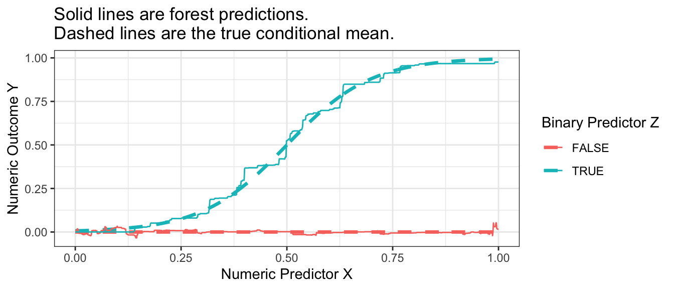
Your turn: A random forest with grf
In practice, it is helpful to work with a function that can choose the tuning parameters of the forest for you. One such function is the regression_forest() function in the grf package.
library(grf)To illustrate its use, we first produce a matrix X of predictors and a vector Y of outcome values.
X <- model.matrix(~ x + z, data = simulated_data)
Y <- simulated_data |> pull(y)
We then estimate the forest with the regression_forest() function, here using the tune.parameters = "all" argument to allow automated tuning of all parameters.
forest <- regression_forest(
  X = X, Y = Y, tune.parameters = "all"
)
We can extract one tree from the forest with the get_tree() function and then visualize with the plot() function.
first_tree <- get_tree(forest, index = 1)
plot(first_tree)
To predict in a new dataset requires a new X matrix,
to_predict <- tibble(z = F, x = seq(0,1,.001)) |>
    bind_rows(tibble(z = T, x = seq(0,1,.001)))

X_to_predict <- model.matrix(~ x + z, data = to_predict)
which can then be used to make predictions.
forest_predicted <- to_predict |>
  mutate(
    yhat = predict(forest, newdata = X_to_predict) |>
      pull(predictions)
  )
When we visualize, we see that the forest from the package is also a good approximator of the conditional mean function. It is possible that the bias of this estimated forest arises from tuning parameters that did not grow sufficiently deep trees.
Code
p_no_points +
  geom_line(
    data = forest_predicted,
    aes(y = yhat)
  ) +
  ggtitle("Solid lines are grf::regression_forest() predictions.\nDashed lines are the true conditional mean.")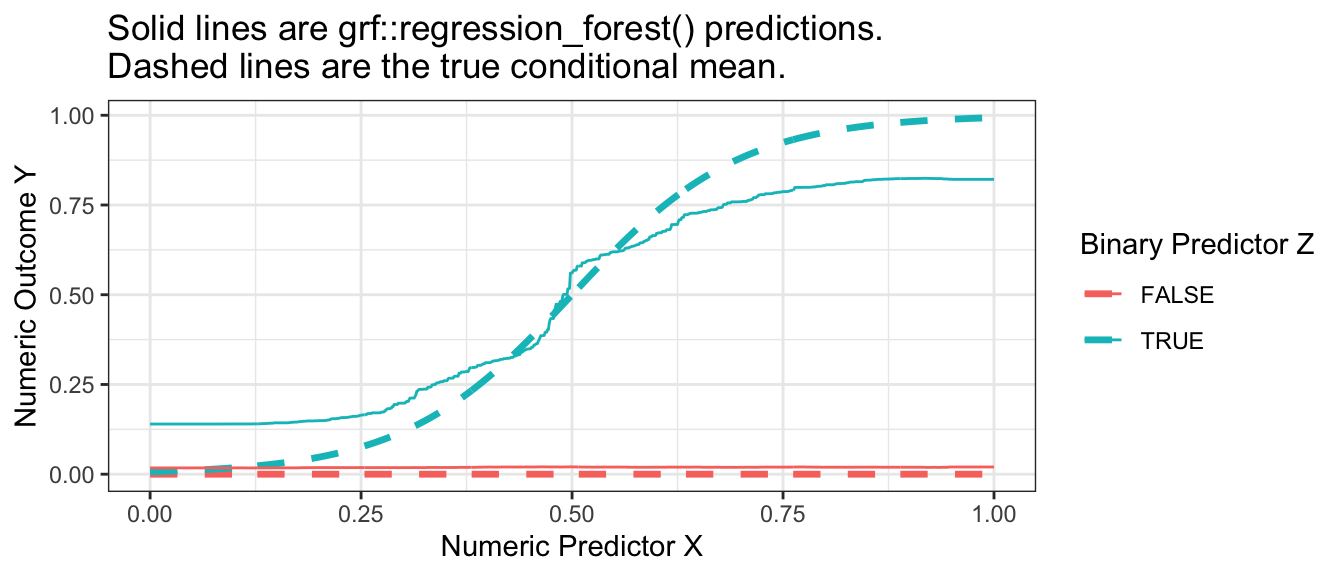
Once you have learned a forest yourself, you might try a regression forest using the baseball_population.csv data or another dataset of your choosing.
Forests as adaptive nearest neighbors
A regression tree can be interpreted as an adaptive nearest-neighbor estimator: the prediction at predictor value \(\vec{x}\) is the average outcome of all its neighbors, where neighbors are defined as all sampled data points that fall in the same leaf as \(\vec{x}\). The estimator is adaptive because the definition of the neighborhood around \(\vec{x}\) was learned from the data.
Random forests can likewise be interpreted as weighted adaptive nearest-neighbor estimators. For each unit \(i\), the predicted value is the average outcome of all other units where each unit \(j\) is weighted by the frequency with which it falls in the same leaf as unit \(i\). Seeing forest-based predictions as a weighted average of other units’ outcomes is a powerful perspective that has led to new advances in forests for uses that go beyond standard regression (Athey, Tibshirani, & Wager 2019).
Gradient boosted trees
To read more on this topic, see Ch 17.2 of Efron & Hastie (2016)
Gradient boosted trees are similar to a random forest in that the result is an average of trees. A key difference is how the trees are produced. In a random forest, the trees are all independent prediction functions learned in parallel. In boosting, the trees are learned sequentially, with each tree correcting the errors of preceding trees. More precisely, the algorithm begins by predicting the sample mean for all observations and defining residuals as the difference between the true outcome \(Y\) and the predicted value. Then the algorithm estimates a regression tree to model the residuals. It adds a regularized version of the predicted residuals to the predicted value, then calculates residuals and fits a new tree to predict the new residuals. Over a series of rounds, the predictions become sequentially closer to the truth, as visualized below.
Code
library(xgboost)
xgboost_illustration <- foreach(round = 1:6, .combine = "rbind") %do% {
  xgboost.out <- xgboost(
    data = model.matrix(~ x + z, data = simulated_data),
    label = simulated_data |> pull(y),
    nrounds = round
  )
  to_predict |>
    mutate(yhat = predict(xgboost.out, newdata = X_to_predict),
           round = paste("After",round,ifelse(round == 1, "round", "rounds"),"of boosting"))
}
p_no_points +
  geom_line(data = xgboost_illustration,
            aes(y = yhat)) +
  facet_wrap(~round) +
  ggtitle("Solid lines are xgboost::xgboost() predictions.\nDashed lines are the true conditional mean.")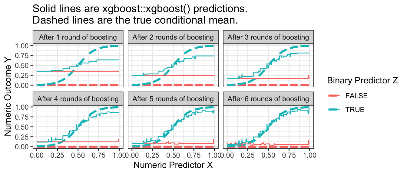
A difficulty in boosting is knowing when to stop: the predictions improve over time but ultimately will begin to overfit. While more trees is always better in a random forest, the same is not true of boosting.
To learn more about boosting in math, we recommend Ch 17.2 of Efron & Hastie (2016). To try boosting, you can install the xgboost package in R and follow the code below.
library(xgboost)To fit a boosting model, first define a predictor matrix and an outcome vector.
X <- model.matrix(~ x + z, data = simulated_data)
Y <- simulated_data |> pull(y)
The code below uses these data to carry out 10 rounds of boosting (recall that the number of rounds is a key tuning parameter, and 10 is only chosen for convenience).
xgboost.out <- xgboost(
  data = model.matrix(~ x + z, data = simulated_data),
  label = simulated_data |> pull(y),
  nrounds = 10
)
Finally, we can define new data at which to predict
to_predict <- tibble(z = F, x = seq(0,1,.001)) |>
    bind_rows(tibble(z = T, x = seq(0,1,.001)))

X_to_predict <- model.matrix(~ x + z, data = to_predict)
and then produce predicted values.
xgboost_predicted <- to_predict |>
  mutate(yhat = predict(xgboost.out, newdata = X_to_predict))
Visualizing the result, we can see that boosting performed well in our simulated example.
p_no_points +
  geom_line(
    data = xgboost_predicted,
    aes(y = yhat)
  ) +
  ggtitle("Solid lines are xgboost::xgboost() predictions.\nDashed lines are the true conditional mean.")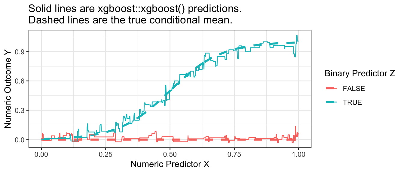
Closing thoughts
Algorithms for prediction are often powerful tools from data science. Because they are \(\hat{Y}\) tools, their application in social science requires us to ask questions involving \(\hat{Y}\). One such category of questions that have been the focus of this page are questions about conditional means. Questions about conditional means are \(\hat{Y}\) questions because the conditional mean \(E(Y\mid\vec{X} = \vec{x})\) would be the best possible prediction of \(Y\) given \(\vec{X} = \vec{x}\) when “best” is defined by squared error loss. We have therefore focused on algorithms for prediction that seek to minimize the sum of squared errors, since these algorithms may often be useful in social science as tools to estimate conditional means.
Footnotes
Raudenbush, S. W., and A.S. Bryk. (2002). Hierarchical linear models: Applications and data analysis methods. Advanced Quantitative Techniques in the Social Sciences Series/SAGE.↩︎
While we write out \(\hat\mu_0\), algorithmic implementations of ridge regression often mean-center \(Y\) before applying the algorithm which is equivalent to having an unpenalized \(\hat\mu_0\).↩︎